Deliverables
- Logo and visual identity
- Social Media templates
- Website
- Welcome Pack
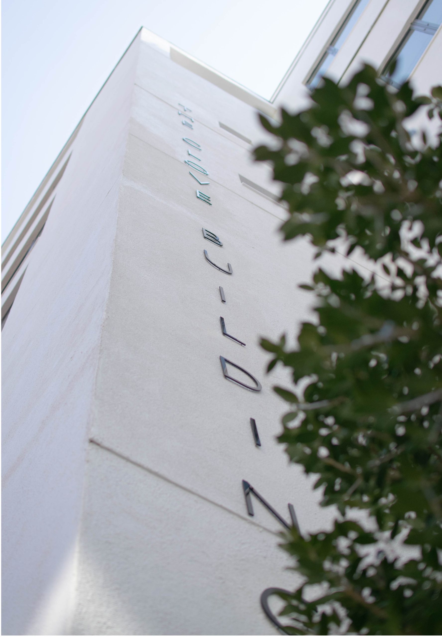
The Clove Building
VISUAL IDENTITY & website
Since The Clove Building’s recent refurbishment by present owners, Dorrington, meant that is was now available to let. Dorrington needed an identity that would promote the modernist style of the building so that it would appeal to individuals looking for a new office space. In keeping with its utilitarian origins and crisp, modernist design, the design ended up doing just that.
With the logo drawing inspiration from the sharp angles of the building and the ever changing uses of the space. It is a completely responsive logo and rarely ever seen in a static state. Keeping true to the neutral colour palette of the building but introducing pops of colour here and there to reflect the modernist style. The patterns were developed from architectural elements in the building.


NEED
HELP WITH
SOMETHING?
TOUCH